5 Design Principles Every Compliance Training Course Should Use

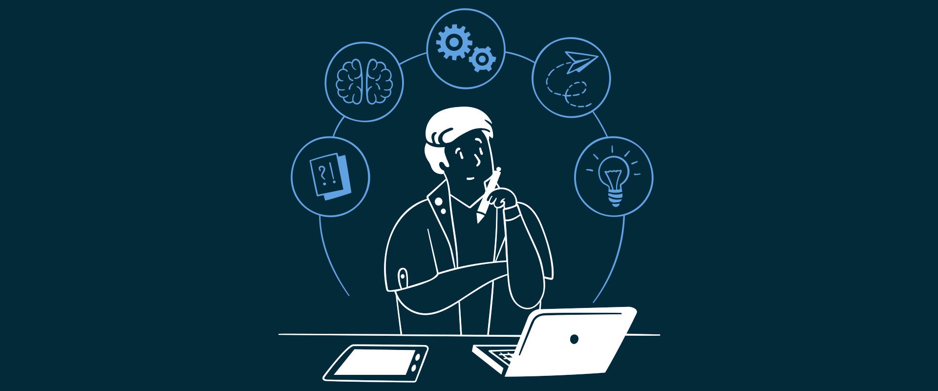
Above: A learning designer thinking through design principles.
Below are five ideas we use in our work every day at Labyrinth Training. They're fundamental principles, grounded in design thinking. I'm hoping that sharing them can help you in your everyday learning design journey.
Let's get into it.

1. Consider mixing your interactions with animation
Everyone loves cartoons. People also love when a light switch turns the light on. Now imagine a cartoon light switch, you click it, it glows, the room illuminates. That's the idea.
Think about your interaction as the midpoint of that animation sequence. What happens before the click sets the expectation. What happens after is the payoff. Let the button bring the surprise. When you design it that way, a single interaction transforms from a necessary step to a memorable moment.
2. Be restrained with colour
The instinct and sometimes pressure is always to include everything... This image, these two brand colours, the logo (Make it bigger!), a gradient for good measure. That ends up looking like a diner menu showing far too many dishes for any kitchen to master. Gordon Ramsay's brain would explode.
Where possible, restrict your colour usage. Experiment with tints and shades of a single colour. Being reductive focuses a layout. Your learners will appreciate you cutting down the noise, even if they can't tell you why (and that's the ultimate win!).

3. Balance your typography
If everything is important, nothing is important. That's the line I think about often when looking at type.
Be intentional with hierarchy. A bold weight on the headline, something lighter in the body, plenty of white space. That combination naturally tells the audience where to look first and feel comfortable. Be intentional with your information design and always be aware of how you prefer your learner to scan a slide, because they will scan it whether you've thought about it or not. Might as well get them to the right place first.
4. Make your interactions meaningful
Don't over-inflate your course with interactions that deliver nothing interesting. The next button is a problem in compliance training, not because of its function, but because it leads to repetitive, predictable outcomes. (We wrote a whole piece about this.)
Every interaction is a small contract with the learner. You choose to interact, we present something back meaningfully. Too often we take these moments for granted. Let's use them to build trust instead.

5. Authenticity wins always
Generic photos have become emblematic of compliance training, whether that's fair or not. What it represents to me is that generic content is the default too often to portray a visual idea. A lot of the time it may be the easiest and possibly the only option, but just know it's hurting credibility and trust with the learner. The effort matters in content design, and if we have the chance to select a more custom illustration, or a video that was made for them, it will matter.